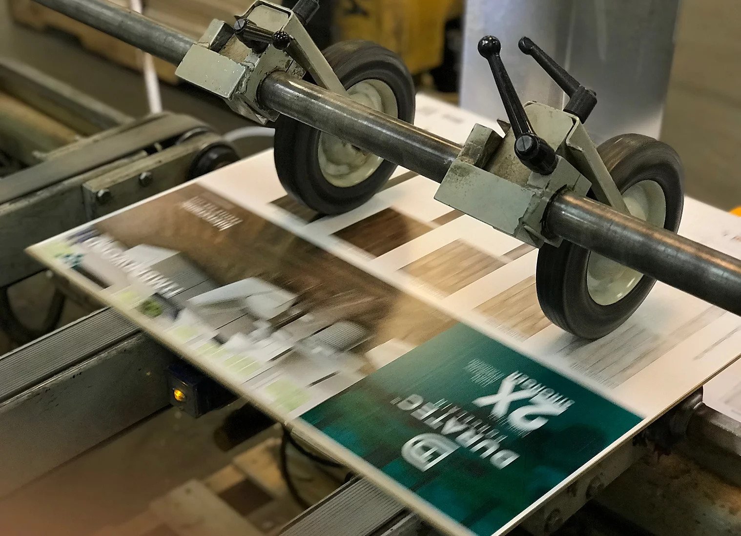
A good quality brochure printed by a commercial printer like PrintArt is one of the best things you can do for your business. A brochure speaks volumes about your products and services, and if it’s designed well, it can help you attract new customers or consolidate existing ones. Here are some tips for good brochure design and publication printing:
1. Choose PrintArt and their graphic designer – Yes, it can be tempting to design your brochure in-house to save on costs, but chances are, the finished product won’t look good. Brief your graphic designer thoroughly on your business, your target audience, and the purpose of the brochure. You’ll also need to brief your designer on any corporate colors and logos you are required to use, as well as the overall intended “look and feel” of the brochure.
2. Be smart with words – Nothing’s worse than a commercial color printing brochure that’s wordy and convoluted. The last thing you want to do is overwhelm your customers with large blocks of text. Remember, a brochure is just the starting point for information about your business – if customers want to know more, they can visit your website. Use plain English, and leave plenty of white space to make it easy on the eyes of your readers. The text should not be smaller than 10 or 11 points to cater to readers with special vision needs.
3. Be smart with pictures – As for pictures, choose quality stock photos that represent your business, or hire a photographer to take photographs of your own staff, facilities, products, or services. Stay away from cheesy graphics at all costs! Photos should be high-resolution and not pixilated so that they reproduce well by your commercial color printing service.
4. Pay attention to the cover – The cover of your brochure is all-important. It should contain a strong message or image that will motivate your customer to open the brochure and read on. As a general rule, the cover should contain little more than a well-chosen image, a logo, and a title or keywords representing your business. A call to action is always effective for cover text.
5. Choose the right stock – Paper makes a difference. Your commercial color printing service will recommend a suitable stock, or paper type, for your brochure. Make sure you get some paper samples to test before you sign off on the stock. It can sometimes be worth paying a little extra for a slightly thicker or coated paper to make your brochure look more polished and professional.
6. Sign off carefully! – Once PrintArt has laid out your new brochure, check the PDF proofs closely for any typos and other errors. ALWAYS request to see a hard-copy printed proof before your brochure goes to print so that you can check the colors closely and do a final proof. Nothing’s worse than receiving delivery of 10,000 new brochures, only to find that the PMS green is wrong, or there’s a spelling error.
It can be a fairly complex process but don’t feel overwhelmed, reach out to PrintArt today, and explain your needs. Their customer service department will put together a cost-effective quote and help your vision come to reality!
PrintArt – Accurate Die Cutting
413 Interchange St.
McKinney, TX 75071
972.562.7921
https://www.printart-adc.com


